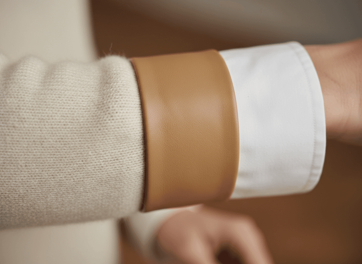
Picture this: You are standing in front of a closet overflowing with clothes, yet everything you put on feels incredibly "blah." You try on a black top with black trousers. It fits perfectly. It is appropriate for the occasion. But when you look in the mirror, the outfit falls flat. It lacks that elusive, magnetic quality you see on street-style icons and runway models. You are experiencing a sartorial flatline, and the culprit is not your body, your budget, or your color palette. The culprit is a lack of texture.
As the era of loud, screaming logomania definitively fades into the background of fashion history, a new visual language has taken over for 2024 and 2025. It is a whisper rather than a shout, and it relies entirely on a concept insiders call tactile dressing. This is the advanced art of combining opposing fabric weights and finishes to trick the human eye into perceiving high-end luxury, regardless of what the price tag says.
If you want to master the new era of style, you need to learn how to execute texture clashing outfits. By understanding the visual psychology of how fabrics interact, you can take a basic e-commerce slip skirt and a thrifted sweater and make them look like a $4,000 runway ensemble. Today, we are diving deep into the tactile dressing rule, teaching you exactly how to mix clothing fabrics to achieve that coveted, expensive-looking aesthetic.

The Visual Psychology Behind Tactile Dressing
To understand why tactile dressing is so powerful, we have to look at how the human brain processes visual information. When we look at an outfit, our brains are subconsciously scanning for depth, contrast, and points of interest. If you wear a flat cotton t-shirt with flat cotton jeans, there is no visual friction. The eye slides right off you.
Retail psychology and textile experts have long known that humans associate complex textures with high value. Historically, fabrics that were difficult to weave, incredibly delicate, or highly textured (like velvet, silk, and heavily cabled wool) were reserved for royalty and the ultra-wealthy. Our modern brains still carry this subconscious bias. When we see a rich collision of textures, our brains immediately register "expensive."
The "Flatness" Trap: Why Your Outfits Look Cheap
Fast fashion has conditioned us to accept "flatness." Synthetic blends, cheap polyesters, and basic jersey knits lack what fashion designers call a "tooth"—the microscopic surface variations that catch the light. When you wear an outfit composed entirely of these flat fabrics, you look one-dimensional.
This is the number one mistake people make when trying to dress elegantly. They focus obsessively on color coordination or silhouette, but completely ignore the surface of the garments. You can wear the most perfectly tailored, color-matched suit in the world, but if it is made from a flat, lifeless fabric, it will never look truly luxurious. Tactile dressing forces you to break out of this flatness trap by introducing intentional visual friction.
Why Your Brain Craves Visual Friction
Visual friction happens when two completely unexpected elements collide. Imagine running your hand over a rough, distressed concrete wall, and then immediately touching a piece of cool, smooth glass. The contrast makes both sensations feel more intense. The same principle applies to how to mix clothing fabrics.
When you pair a heavy, light-absorbing fabric (like chunky alpaca wool) with a weightless, light-reflecting fabric (like liquid satin), you create a visual feast. The wool makes the satin look even more delicate and expensive, while the satin makes the wool look richer and cozier. They elevate each other through their opposition. This is the foundational secret behind the wardrobes of the world's most stylish women.
The Core Principles of Texture Clashing Outfits
Now that we understand the psychology, let us break down the mechanics. Executing texture clashing outfits is not about throwing random pieces together in the dark. It requires a strategic approach to light, weight, and finish. If you want to utilize advanced fashion styling hacks, you must master these core principles.
The Rule of Opposites: Light, Weight, and Friction
The golden rule of tactile dressing is to pair opposites. Never put two fabrics next to each other that share the same dominant characteristic. To do this effectively, you need to categorize your wardrobe into three main texture profiles:
- Light-Reflecting (The Shines): Silk, satin, patent leather, sequins, high-shine vinyl, and smooth metallics. These fabrics bounce light back at the viewer, drawing the eye and adding a liquid quality to the outfit.
- Light-Absorbing (The Mattes): Suede, velvet, corduroy, heavy wool, cashmere, and distressed denim. These fabrics swallow light, creating deep shadows, richness, and a feeling of grounded weight.
- The Neutrals (The Bridges): Crisp poplin cotton, basic denim, smooth tropical wool, and fine-gauge merino. These are your foundational fabrics that bridge the gap between the extremes.
An expensive-looking outfit almost always features a collision between a Light-Reflecting fabric and a Light-Absorbing fabric. The more extreme the difference, the more striking the result.
Monochromatic Texture Styling: The Billionaire Aesthetic
If there is one specific technique that defines the 2024/2025 luxury aesthetic, it is monochromatic texture styling. You have likely seen this all over your social media feeds: an influencer wearing an outfit composed entirely of varying shades of cream, butter yellow, or slate gray. Why does it look so incredibly chic?
When you remove color contrast from an outfit, texture becomes the only way your eye can distinguish where one garment ends and another begins. Monochromatic texture styling forces you to rely entirely on fabric differences to create the silhouette.
Imagine an all-black outfit. A black cotton shirt and black cotton pants look like a uniform. But a black sheer organza blouse tucked into black leather trousers, worn under a black fuzzy mohair coat? That is a masterclass in tactile dressing. The absence of color allows the textures to take center stage, which is the ultimate hallmark of quiet luxury layering.

Advanced Fashion Styling Hacks for Mixing Fabrics
Understanding the theory is great, but getting dressed happens in the real world. Many women feel intimidated by the idea of mixing fabrics, fearing they will look messy or chaotic rather than curated and expensive. Here are the advanced fashion styling hacks that fashion editors use to get it right every single time.
The "Sandwich" Method for Quiet Luxury Layering
One of the most effective ways to balance a highly textured outfit is the Sandwich Method. This technique involves balancing a heavy texture on your top half with a similar visual weight on your feet, "sandwiching" a lighter, contrasting texture in the middle.
For example, you might wear an oversized, heavy cable-knit sweater (heavy). You pair it with a delicate, semi-sheer chiffon midi skirt (light). To ground the look and complete the sandwich, you finish with a pair of chunky, structural leather riding boots (heavy). The heavy top and heavy bottom frame the delicate skirt perfectly, ensuring the outfit feels intentional and grounded rather than top-heavy.
The Rule of Three Textures
When learning how to mix clothing fabrics, a good rule of thumb is to aim for exactly three distinct textures in any given outfit. Two textures can sometimes feel a bit basic, while four or more can easily veer into "costume" territory. Three is the magic number for visual harmony.
A flawless three-texture formula looks like this: A structured base (like crisp cotton poplin), a tactile overlay (like a bouclé jacket), and a high-shine accent (like a patent leather bag or shoes). This triad provides structure, depth, and illumination, hitting all the psychological triggers for an expensive-looking ensemble.
Masterclass: How to Mix Clothing Fabrics by Season
Tactile dressing changes with the weather, but the principles remain the same. In the winter, quiet luxury layering is relatively easy. You have access to shearling, heavy wools, and thick leathers. You can contrast these with fine silk scarves or smooth leather gloves.
Summer, however, is the true test of your styling abilities. When it is too hot for heavy wool, how do you create texture? You turn to warm-weather opposites. Pair rough, slubby linen with smooth, glossy silk. Mix structured, rigid raw denim with a flimsy, semi-sheer pointelle knit. The contrast in summer is less about weight and more about structure versus fluidity.
Real-World Case Studies: From E-Commerce Basic to High-End Hero
To truly grasp the power of texture clashing outfits, we need to look at practical examples. Let us take basic items you probably already own, or can easily buy from affordable e-commerce sites, and transform them using the tactile dressing rule.
Look 1: The Liquid Silk & Distressed Wool Collision
The Basic Concept: A sweater and a skirt.
The Cheap Execution: A flat cotton-blend sweater worn over a matte polyester midi skirt. The eye glides right over it. It feels uninspired and distinctly mass-market.
The Tactile Dressing Upgrade: Swap the flat sweater for a deeply textured, slightly distressed oversized brushed alpaca sweater. Swap the polyester skirt for a bias-cut liquid silk slip skirt. The heavy, fuzzy halo of the alpaca wool contrasts violently—and beautifully—with the smooth, reflective surface of the silk. Add a pair of suede ankle boots to introduce a third texture (matte light-absorbing). Suddenly, this simple silhouette looks like it walked off a runway in Milan.
Look 2: Crisp Poplin Meets Slouchy Suede
The Basic Concept: A button-down shirt and a jacket.
The Cheap Execution: A soft jersey t-shirt under a basic flat cotton utility jacket. It lacks structure and visual interest.
The Tactile Dressing Upgrade: Start with a hyper-crisp, heavily starched white cotton poplin button-down shirt. The collar should be sharp enough to cut glass. Layer this under an oversized, buttery-soft, unstructured suede jacket. The rigid, architectural nature of the crisp cotton provides a stunning contrast to the slouchy, light-absorbing drape of the suede. This is a prime example of mixing structure with fluidity.
Look 3: High-Shine Leather and Cashmere Clouds
The Basic Concept: Black pants and a sweater.
The Cheap Execution: Black cotton leggings with a black acrylic turtleneck. This is the definition of the "flatness trap." It looks like gym wear disguised as daywear.
The Tactile Dressing Upgrade: Embrace monochromatic texture styling. Swap the leggings for high-shine black leather (or high-quality faux leather) trousers. Pair them with a voluminous, cloud-like black cashmere or mohair sweater. The leather reflects the ambient light, highlighting the contours of the legs, while the matte, fuzzy sweater absorbs the light, softening the upper body. The all-black palette makes the stark difference in fabrics the star of the show.
Addressing the Fear: Will I Look Bulky?
One of the biggest objections women have when attempting tactile dressing and quiet luxury layering is the fear of adding physical bulk. It is a valid concern; highly textured fabrics like cable knits, boucle, and faux fur do add physical volume to the body. However, advanced fashion styling hacks can easily mitigate this issue.
Proportion Play: Keeping Your Silhouette Sharp
When you are wearing highly textured, voluminous fabrics, you must rely on proportion play to maintain your silhouette. If you are wearing a chunky, heavily textured sweater, do not pair it with wide-leg, heavily textured corduroy pants. That is a recipe for looking like a walking armchair.
Instead, follow the rule of volume contrast. Pair your bulky, tactile pieces with sleek, streamlined opposites. A massive shearling jacket looks incredibly chic and flattering when paired with razor-sharp, slim-cut leather trousers. The slim bottom half anchors the volume of the top half.
The "Anchor Piece" Strategy
If you are nervous about texture clashing outfits, start small by using an "anchor piece." An anchor piece is a highly structured, tailored garment that brings discipline to an otherwise wild mix of fabrics. A sharply tailored wool blazer can anchor a sheer lace blouse and a shiny satin skirt. The sharp lines of the blazer communicate intentionality and tailoring, proving to the eye that the outfit is a deliberate fashion choice, not a haphazard accident.
Additionally, always remember to show your "hinges"—your wrists, ankles, and neck. Pushing up the sleeves of a chunky sweater to reveal a bare wrist or a sleek metal watch provides a moment of visual relief from the heavy fabric, instantly slimming the overall appearance of the outfit.
Frequently Asked Questions About Tactile Dressing
Mastering the art of texture mixing takes practice. To help you refine your skills, here are the answers to the most common questions about this transformative styling technique.
What exactly is tactile dressing?Tactile dressing is a styling technique that prioritizes the mix of different fabric textures, weights, and finishes (like pairing smooth silk with chunky wool) to create visual interest. Instead of relying on loud prints or bright colors, tactile dressing uses the physical surface of the clothing to make an outfit look sophisticated, complex, and expensive.
Can I wear texture clashing outfits to the office?Absolutely. In fact, tactile dressing is the secret to making corporate wear look less boring. To keep it professional, stick to a muted or neutral color palette (monochromatic texture styling works beautifully here). Try pairing a crisp cotton poplin shirt with a textured tweed pencil skirt, or wear a smooth silk camisole under a structured, slightly nubby wool blazer. It adds personality without violating dress codes.
How do I start with monochromatic texture styling on a budget?You do not need a designer budget to master how to mix clothing fabrics. Start by shopping your own closet. Group your clothes by color (e.g., all your blacks, all your creams). Then, look at the textures within those color groups. Try pairing your most textured black piece (like a ribbed sweater) with your smoothest black piece (like a satin skirt). When shopping thrift stores or budget retailers, prioritize pieces with strong textural identities—like faux suede, ribbed knits, or high-shine faux leather—rather than flat cotton blends.
What are the biggest mistakes when learning how to mix clothing fabrics?The most common mistake is mixing textures that are too similar, which just looks like you tried to match them and failed (for example, wearing two slightly different types of flat cotton). Another mistake is ignoring the weight of the fabrics. Wearing a heavy, dark velvet skirt with a flimsy, bright summer cotton tank top creates a seasonal clash that confuses the eye. Always ensure your textures have enough contrast to look intentional, but share a seasonal appropriateness.
Does quiet luxury layering work for warmer climates?Yes, quiet luxury layering is entirely possible in the heat; you just have to swap your materials. Instead of wool and leather, focus on mixing warm-weather textures. Pair the rough, organic slub of pure linen with the sleek, reflective surface of silk or satin. Mix structured, open-weave crochet pieces with smooth, lightweight cotton poplin. The contrast between matte/rough and shiny/smooth is just as effective in the summer as it is in the winter.
By embracing the tactile dressing rule, you will never look at your wardrobe the same way again. You will stop seeing just "a black shirt" and start seeing "a matte, light-absorbing base." You will stop feeling bored by your neutrals and start realizing that a cream-colored outfit is actually a blank canvas for a masterpiece of texture. Stop settling for flat, one-dimensional outfits. Start mixing, start clashing, and watch as your everyday style transforms into something undeniably expensive.